Nordisk Redovisning
An accounting firm that feels personal and in control — deep forest green, warm brass and a client portal that keeps every document in one place.
- Sector
- Accounting
- Scope
- Identity · Website · Mobile · Social media
The brief
An accounting firm for small and growing businesses offering bookkeeping, payroll, tax returns and business advice. Business owners want an adviser they can trust and a simple way to share documents and stay up to date — and a generic site with a stock photo of binders and a calculator says nothing about how working together would feel.
The idea
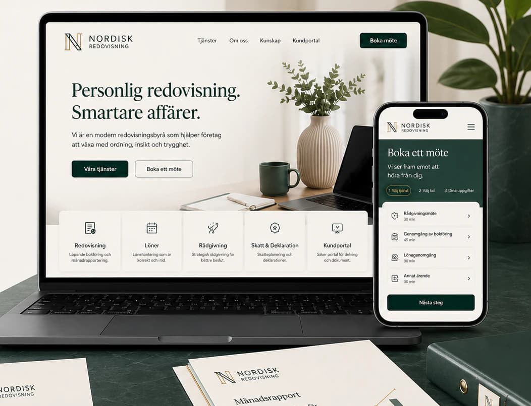
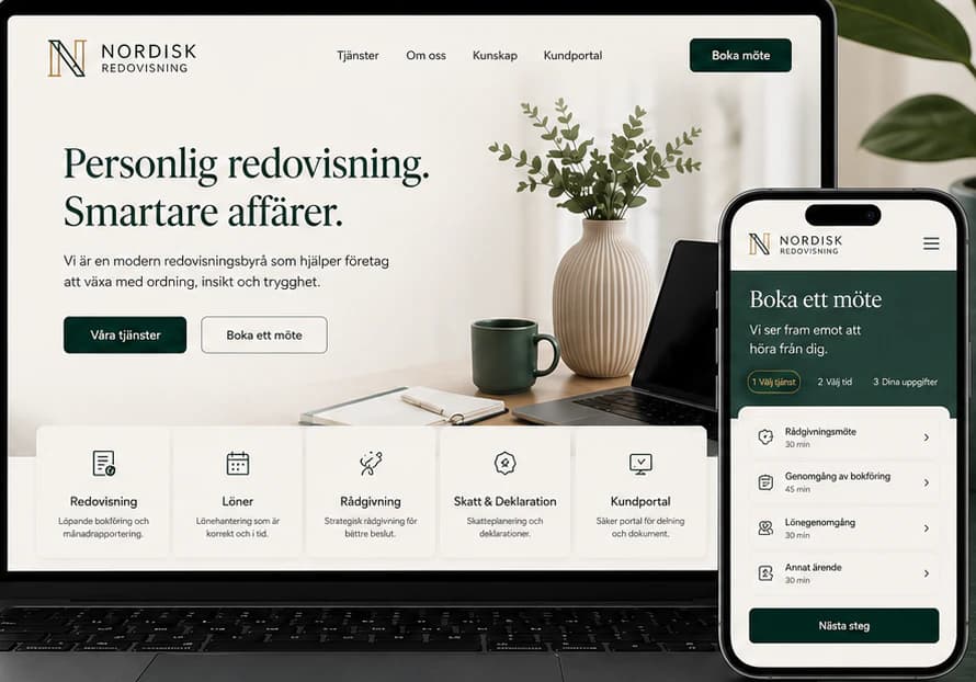
We built the identity on calm order: deep forest green, sage, stone and a warm brass accent, an N monogram and a classic serif. The website opens with a personal promise, offers two clear steps — see the services or book a meeting — and lets clients book a meeting in three steps and log in to a portal for documents, reports, tasks and messages with their own adviser. The same identity carries through the monthly reports, notebooks, social posts and story ads.
Identity
Colour
Typography
Nordisk Redovisning
ABCDEFGHIJKLMNOPQRSTUVWXYZ ÅÄÖ
abcdefghijklmnopqrstuvwxyz åäö 0123456789
Aa Bb Cc
ABCDEFGHIJKLMNOPQRSTUVWXYZ ÅÄÖ
abcdefghijklmnopqrstuvwxyz åäö 0123456789
The website
How the start page works — follow the numbers.
Key screens
What the site does
Before and after
The generic site a brand like this often starts with, and the concept that replaces it.
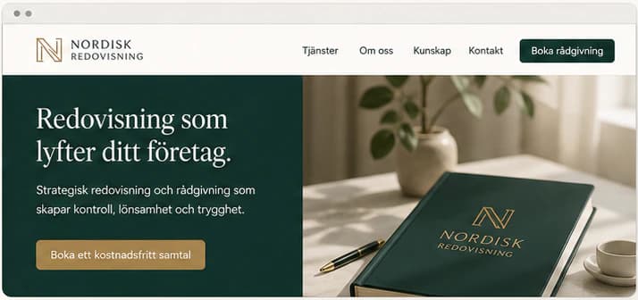
- A strong brand identity that is recognised and trusted
- A clear structure and an intuitive experience
- Clear positioning around the client's needs
- Real settings and imagery that build credibility
- A premium feel that builds trust and sets the firm apart
Social media
The brand in use
A design concept by Weva Digital. The brand, website and materials are imagined to show what we can build — this is not a client project.