Nordisk Rehab Studio
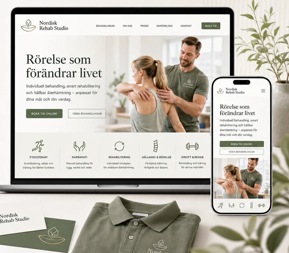
A physiotherapy and naprapathy studio that feels like calm movement — sage green, warm light and a treatment booked online in a few steps.
- Sector
- Rehabilitation
- Scope
- Identity · Website · Mobile · Social media
The brief
A studio for physiotherapy, naprapathy, rehabilitation, posture training and sports rehab. Patients in pain want to understand the treatment, choose a therapist and book quickly — and a dated, generic clinic site with unclear information and hidden booking sends them to the next clinic.
The idea
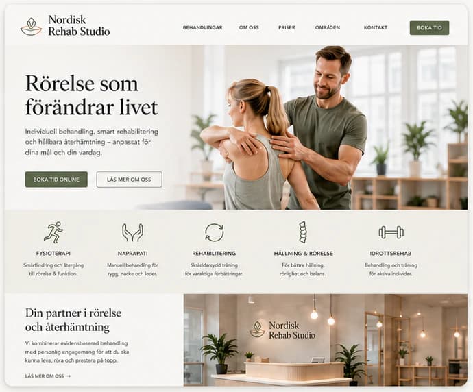
We built the identity on calm and nature: forest and sage greens, warm stone, off-white and a touch of gold, a lotus-and-hands mark and an elegant serif with a clean sans. The website opens on movement — a warm portrait and one promise — and gives every treatment its own page with a “Book” button, therapist profiles with their background, clear patient information, and booking by treatment, therapist, date and time. The same identity runs through the sign and reception, uniforms and towels, Instagram posts and stories.
Identity
Colour
Typography
Nordisk Rehab Studio
ABCDEFGHIJKLMNOPQRSTUVWXYZ ÅÄÖ
abcdefghijklmnopqrstuvwxyz åäö 0123456789
Aa Bb Cc
ABCDEFGHIJKLMNOPQRSTUVWXYZ ÅÄÖ
abcdefghijklmnopqrstuvwxyz åäö 0123456789
The website
How the start page works — follow the numbers.
Key screens
What the site does
Before and after
The generic site a brand like this often starts with, and the concept that replaces it.
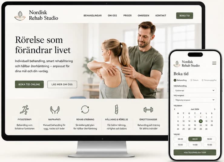
- A modern, professional and trustworthy design
- Clear information and a smooth experience
- Simple, fast booking
- A strong brand that builds trust and loyalty
Social media
The brand in use
A design concept by Weva Digital. The brand, website and materials are imagined to show what we can build — this is not a client project.