North Padel Club
A padel club that feels like a members' club — dark courts, lime light and a court booked in three taps.
- Sector
- Sports
- Scope
- Identity · Website · Mobile · Social media
The brief
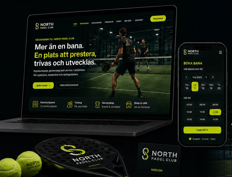
A premium indoor padel club in a crowded market. Players compare clubs on their phones, between matches, and move on when booking is slow or prices are unclear. The club needs a brand that carries the energy of the game and a website that turns it into booked courts and new members.
The idea
We built the identity around the court at night: deep green, one acid-lime accent and a bold condensed headline face. The website puts booking first — a live court calendar, three clear membership tiers, and training and events one tap from the start page — and the same system runs through social media, merchandise and the members' card.
Identity
Colour
Typography
North Padel Club
ABCDEFGHIJKLMNOPQRSTUVWXYZ ÅÄÖ
abcdefghijklmnopqrstuvwxyz åäö 0123456789
Aa Bb Cc
ABCDEFGHIJKLMNOPQRSTUVWXYZ ÅÄÖ
abcdefghijklmnopqrstuvwxyz åäö 0123456789
The website
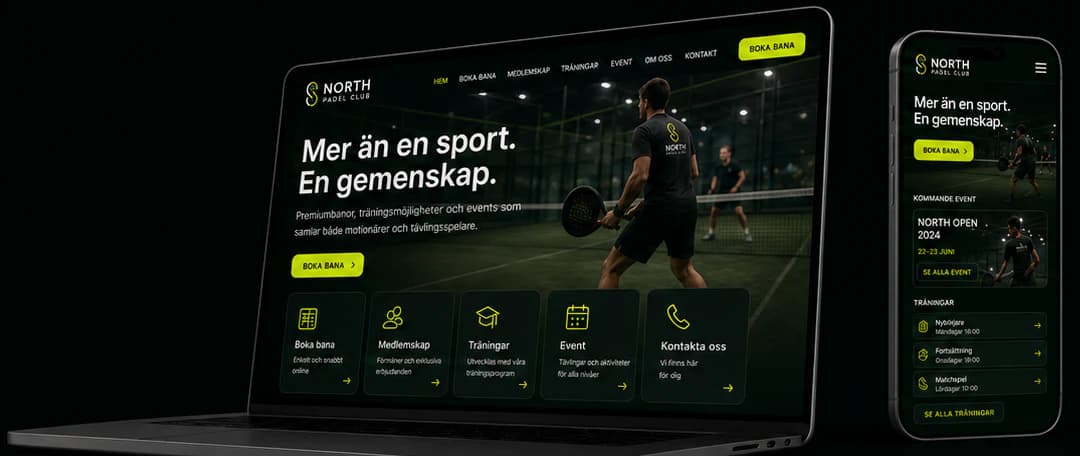
How the start page works — follow the numbers.
Key screens
What the site does
Before and after
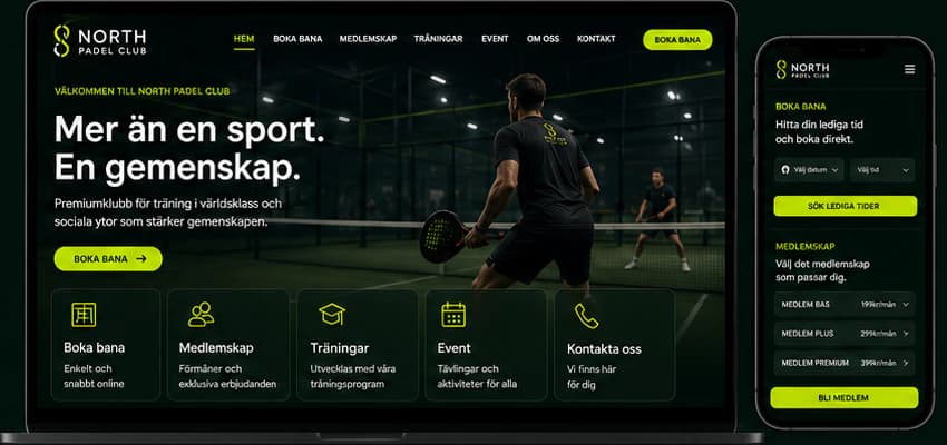
The generic site a brand like this often starts with, and the concept that replaces it.
- A distinctive club identity
- Booking built into every page
- Memberships that are easy to compare
- One system across web, social and merchandise
Social media
The brand in use
A design concept by Weva Digital. The brand, website and materials are imagined to show what we can build — this is not a client project.