Tandkliniken
A dental clinic that feels calm before the first visit — deep navy, clear teal, plenty of light and the phone one tap away.
- Sector
- Dental
- Scope
- Identity · Website · Mobile · Social media
The brief
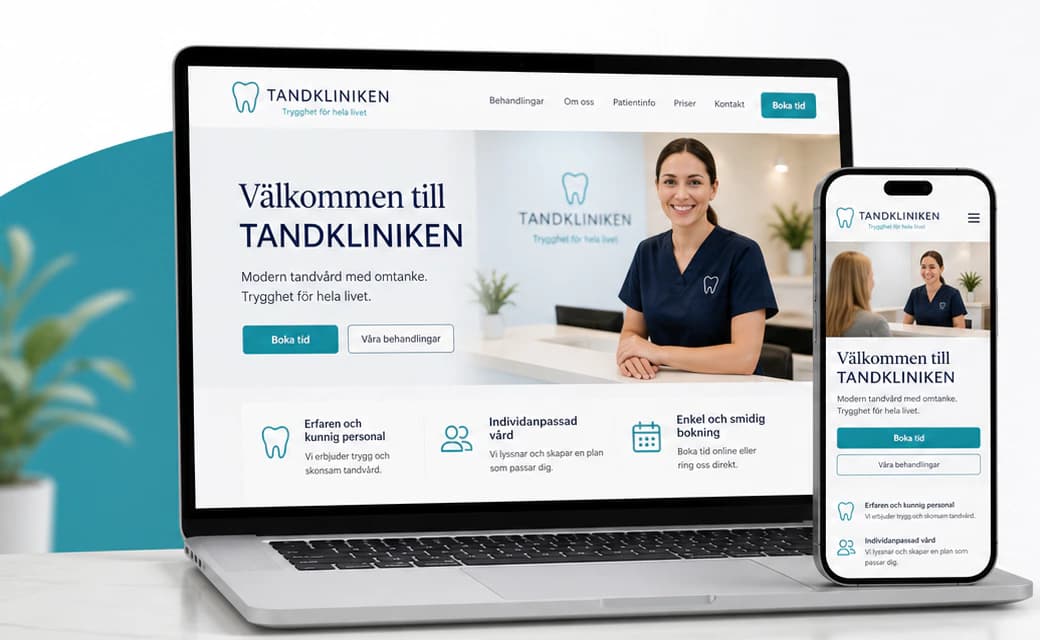
A family dental clinic offering general dentistry, cosmetic treatments, implants, orthodontics and emergency care. Many patients are nervous, and most still prefer to call — so a dated, generic site with an unclear message and no obvious number loses them before they ever speak to anyone.
The idea
We built the identity on reassurance: deep navy and a clear teal on bright white, a line-drawn tooth mark and a warm serif for headlines. The website says the promise first, offers two equal ways in — book online or call — and gives every page a clear job: treatments, patient information, the clinic and its team, and why patients can feel safe. Click-to-call is everywhere, and the same calm runs through the Instagram profile, stories, stationery and the sign on the street.
Identity
Colour
Typography
Tandkliniken
ABCDEFGHIJKLMNOPQRSTUVWXYZ ÅÄÖ
abcdefghijklmnopqrstuvwxyz åäö 0123456789
Aa Bb Cc
ABCDEFGHIJKLMNOPQRSTUVWXYZ ÅÄÖ
abcdefghijklmnopqrstuvwxyz åäö 0123456789
The website
How the start page works — follow the numbers.
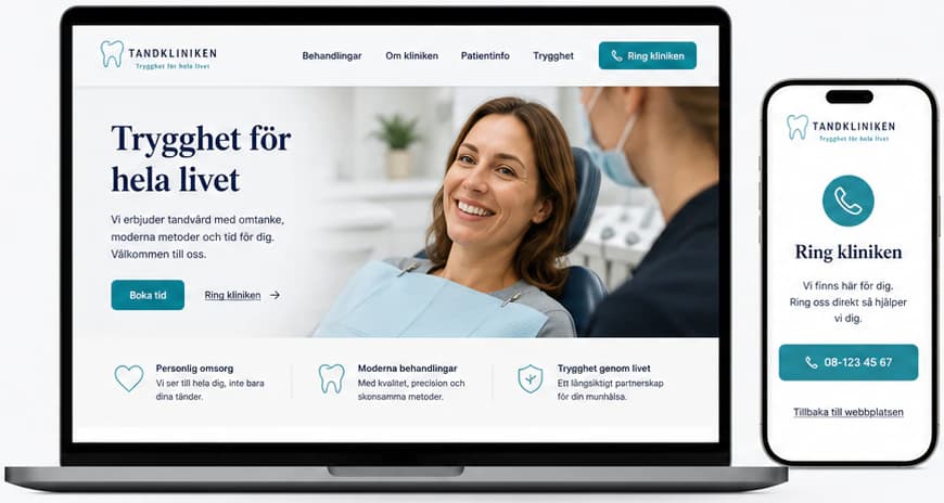
Key screens
What the site does
Before and after
The generic site a brand like this often starts with, and the concept that replaces it.
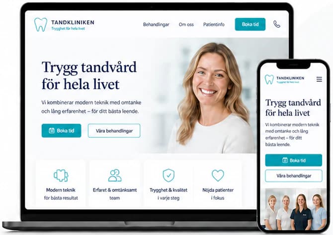
- Modern and reassuring
- Clear treatments
- Easy to call
- A better experience on mobile
- Every page leads to a booking or a call
Social media
The brand in use
A design concept by Weva Digital. The brand, website and materials are imagined to show what we can build — this is not a client project.