Nord Ink Studio
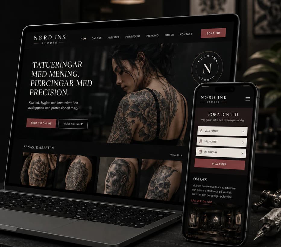
A tattoo and piercing studio that feels like the room itself — near-black, dark rose and a booking that picks the artist, the date and the time.
- Sector
- Tattoo Studio
- Scope
- Identity · Website · Mobile · Social media
The brief
A tattoo and piercing studio with several artists, each with their own style, from fine line and realism to neo-traditional. Clients choose a studio by its artists and its portfolio, often from Instagram, and want clear prices and an easy way to book — and an anonymous, generic studio site with one stock photo shows none of what makes the studio worth the wait.
The idea
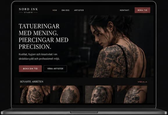
We built the identity on precision and atmosphere: near-black, charcoal, bone white and a dark rose accent, a circular N monogram and a classic serif. The website opens with a confident promise and lets the work speak — latest pieces, artist profiles with their styles, clear tattoo and piercing prices, and a five-step booking that chooses service, artist, date and time before confirming. The same identity carries through the sign, business cards, Instagram posts, story frames and highlight icons.
Identity
Colour
Typography
Nord Ink Studio
ABCDEFGHIJKLMNOPQRSTUVWXYZ ÅÄÖ
abcdefghijklmnopqrstuvwxyz åäö 0123456789
Aa Bb Cc
ABCDEFGHIJKLMNOPQRSTUVWXYZ ÅÄÖ
abcdefghijklmnopqrstuvwxyz åäö 0123456789
The website
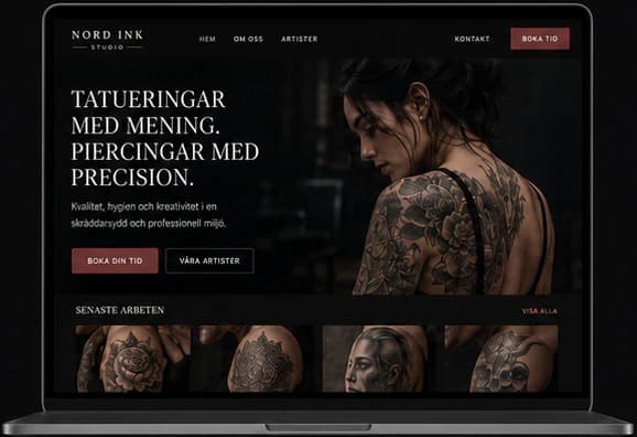
How the start page works — follow the numbers.
Key screens
What the site does
Before and after
The generic site a brand like this often starts with, and the concept that replaces it.
- A strong identity: your studio, your style, your story
- A premium feel that raises perceived value
- A structure built around the studio's services and artists
- A simpler booking flow that makes booking easy
Social media
The brand in use
A design concept by Weva Digital. The brand, website and materials are imagined to show what we can build — this is not a client project.