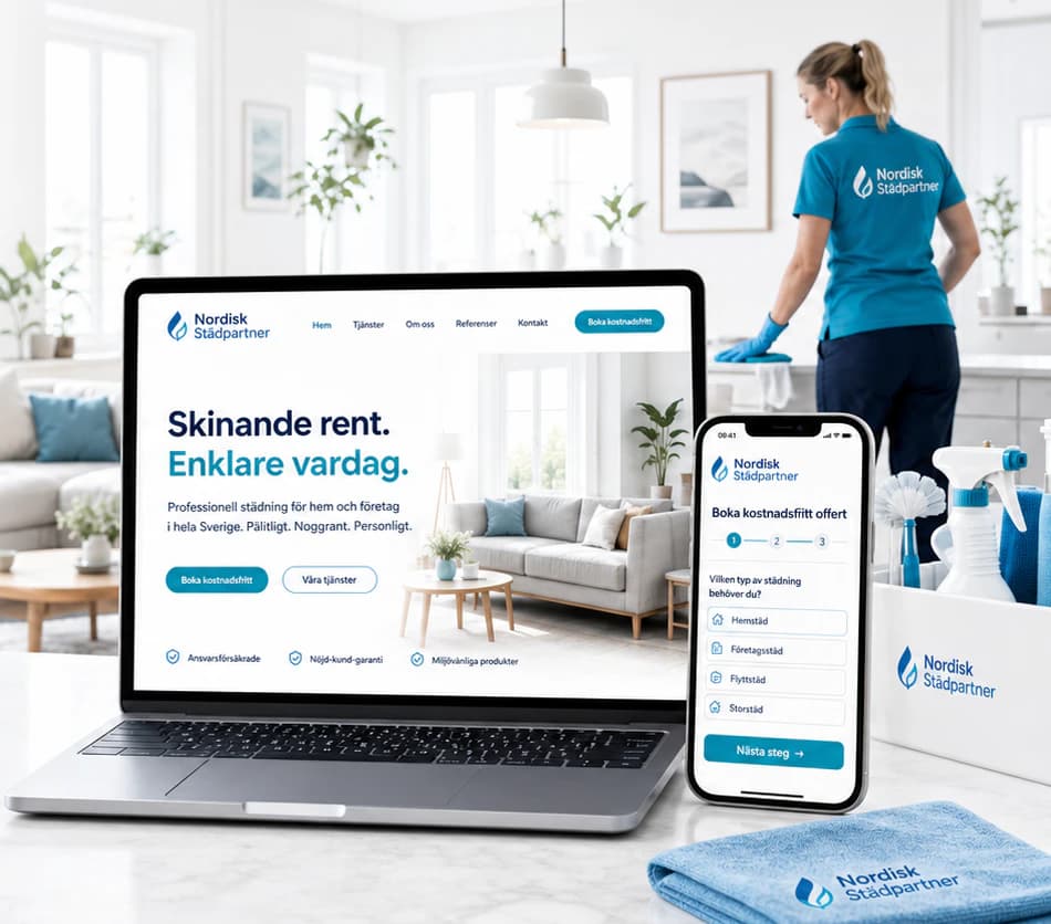
Nordic Commercial
Commercial property presented like architecture — dark glass, warm gold and listings a company can judge at a glance.
- Sector
- Commercial Real Estate
- Scope
- Identity · Website · Mobile · Social media
The brief
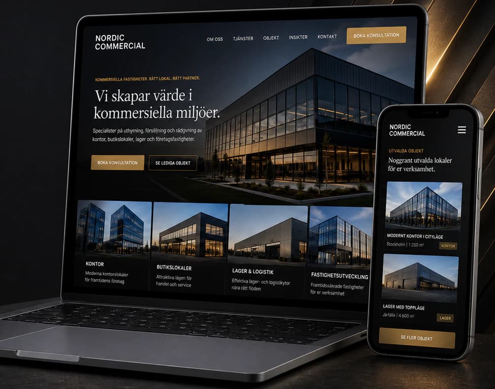
A commercial real-estate firm that leases, sells and advises on offices, retail premises, warehouses and company-owned properties. Businesses looking for premises compare options online, and a generic site with few pictures and vague listings makes it hard to see what is available — so the enquiries that do come in are vague too.
The idea
We gave the brand the calm of a premium address: near-black, graphite and a single warm gold, a classic serif for headlines and a precise sans for facts. The website leads with the buildings themselves — large evening photography, four clear property types, and listings with area, location and type that can be filtered and booked for a viewing. The same system carries over to the brochure, the business card and a LinkedIn and Instagram feed of new listings and market insight.
Identity
Colour
Typography
Nordic Commercial
ABCDEFGHIJKLMNOPQRSTUVWXYZ ÅÄÖ
abcdefghijklmnopqrstuvwxyz åäö 0123456789
Aa Bb Cc
ABCDEFGHIJKLMNOPQRSTUVWXYZ ÅÄÖ
abcdefghijklmnopqrstuvwxyz åäö 0123456789
The website
How the start page works — follow the numbers.
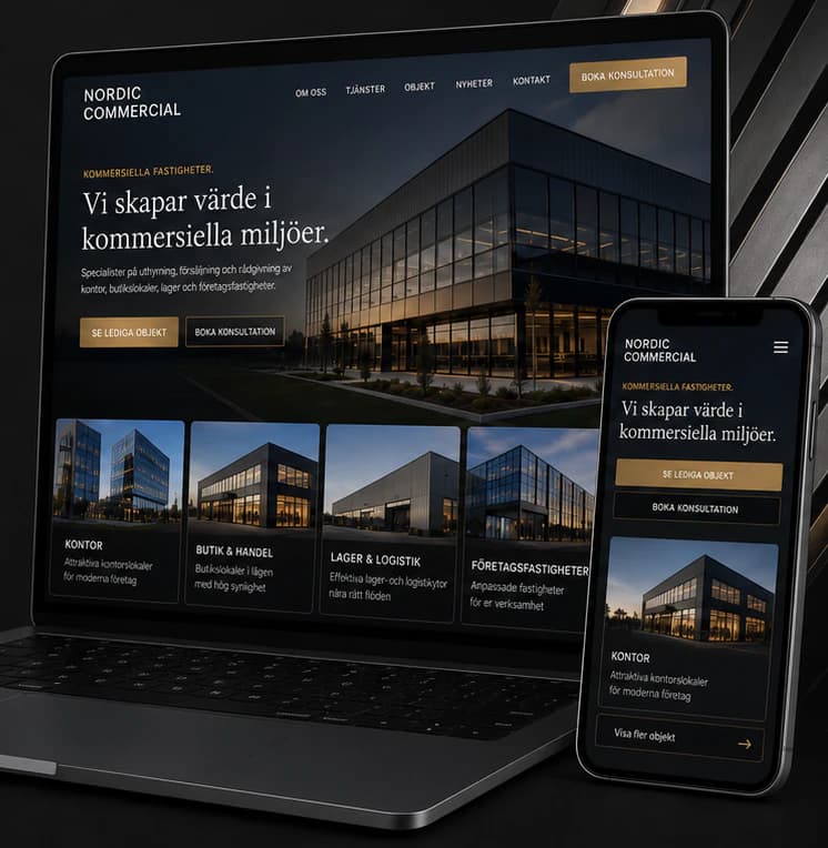
Key screens
What the site does
Before and after
The generic site a brand like this often starts with, and the concept that replaces it.
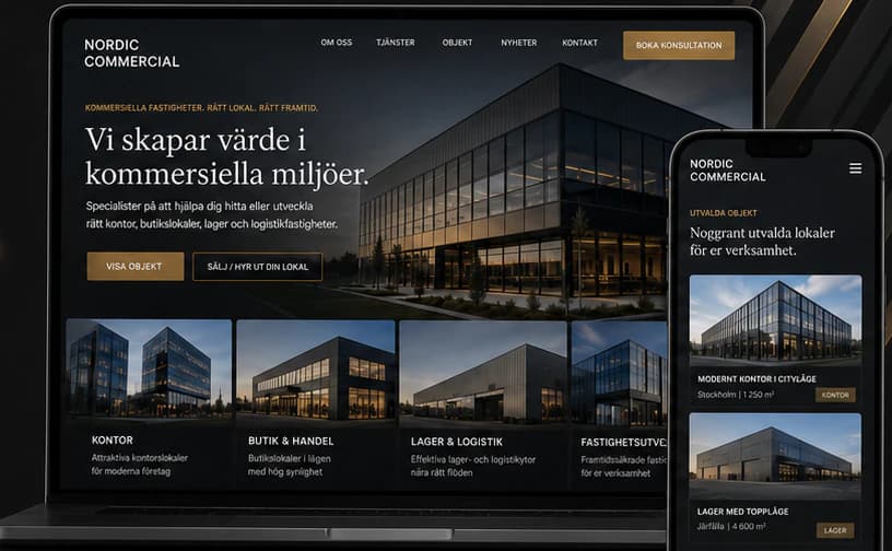
- Stronger credibility and trust
- A clear, inspiring presentation of every property
- An experience built for the phone
- A clear path to qualified enquiries
Social media
The brand in use
A design concept by Weva Digital. The brand, website and materials are imagined to show what we can build — this is not a client project.