Nordisk Städpartner
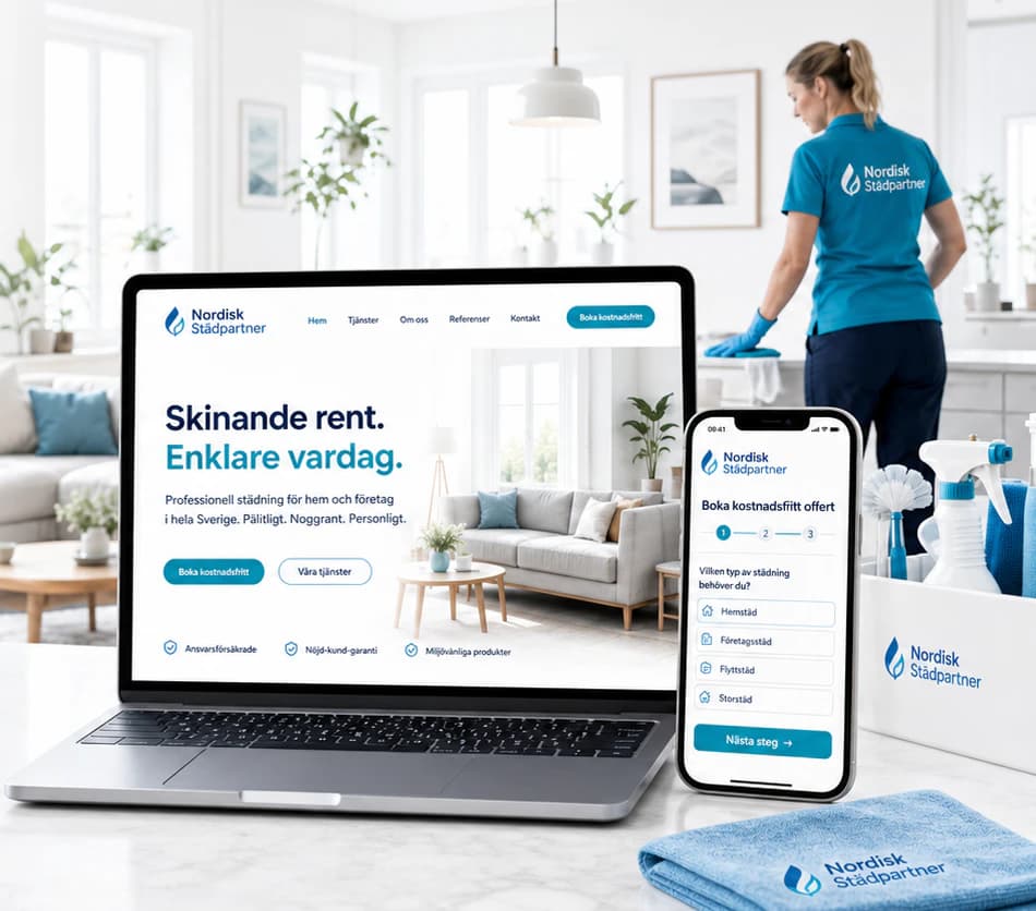
A cleaning company that feels as fresh as a clean home — clear blue, plenty of white and a free quote three steps away.
- Sector
- Cleaning
- Scope
- Identity · Website · Mobile · Social media
The brief
A cleaning company for homes and businesses: regular home cleaning, office cleaning, move-out cleaning and deep cleaning. Customers choose on trust, price and how easy it is to book, and a generic site with hidden calls to action and nothing that proves quality leaves them unsure who will actually come through the door.
The idea
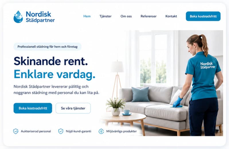
We built the identity on a water drop and a crisp, clean blue against generous white space, with a friendly, modern sans for everything. The website says the promise in two lines, makes a free quote the main action and walks the customer through it in three steps — service, details, confirmation — with trust signals right under the buttons. The same identity runs from the van and the uniforms to business cards, quotes and a social feed of services and cleaning tips.
Identity
Colour
Typography
Nordisk Städpartner
ABCDEFGHIJKLMNOPQRSTUVWXYZ ÅÄÖ
abcdefghijklmnopqrstuvwxyz åäö 0123456789
The website
How the start page works — follow the numbers.
Key screens
What the site does
Before and after
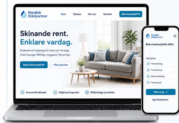
The generic site a brand like this often starts with, and the concept that replaces it.
- A professional design with guarantees and trust signals
- A clear message about services and value
- Fast, simple and built for the phone
- Visible, clear calls to action for booking
- A consistent, modern and recognisable brand
Social media
The brand in use
A design concept by Weva Digital. The brand, website and materials are imagined to show what we can build — this is not a client project.