Nordisk Optik
An optician that feels as clear as good eyesight — deep navy, airy whites and an eye test booked in a few taps.
- Sector
- Optics
- Scope
- Identity · Website · Mobile · Social media
The brief
An optician offering eye tests, glasses and contact lenses from its own shop. Customers compare opticians online, often on their phones, and choose on trust and convenience — and a generic chain-style site with a cluttered layout and offers everywhere makes a local, expert optician look like everyone else.
The idea
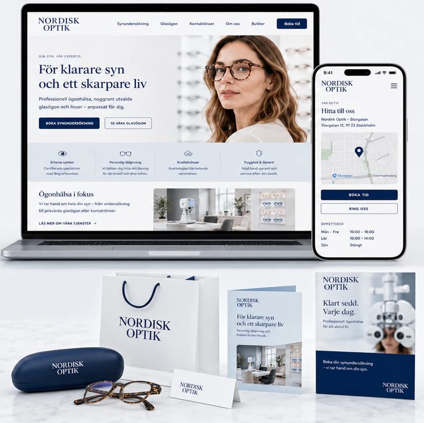
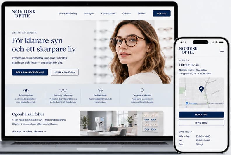
We built the identity on clarity: deep navy, soft blue-greys and plenty of white, with a classic serif wordmark that feels like a well-made pair of frames. The website leads with care — a calm portrait, one promise and two clear actions — and gives each need its own path: book an eye test in four steps, browse frames by category with prices, and find the shop with opening hours and one-tap calling. The same identity carries through the bags, cases, brochures, cards and social posts.
Identity
Colour
Typography
Nordisk Optik
ABCDEFGHIJKLMNOPQRSTUVWXYZ ÅÄÖ
abcdefghijklmnopqrstuvwxyz åäö 0123456789
Aa Bb Cc
ABCDEFGHIJKLMNOPQRSTUVWXYZ ÅÄÖ
abcdefghijklmnopqrstuvwxyz åäö 0123456789
The website
How the start page works — follow the numbers.
Key screens
What the site does
Before and after
The generic site a brand like this often starts with, and the concept that replaces it.
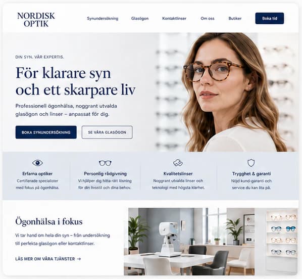
- An elegant, modern design
- A clear structure and simple navigation
- Optimised for every device
- Strong trust and expertise
- Relevant information, always close at hand
Social media
The brand in use
A design concept by Weva Digital. The brand, website and materials are imagined to show what we can build — this is not a client project.