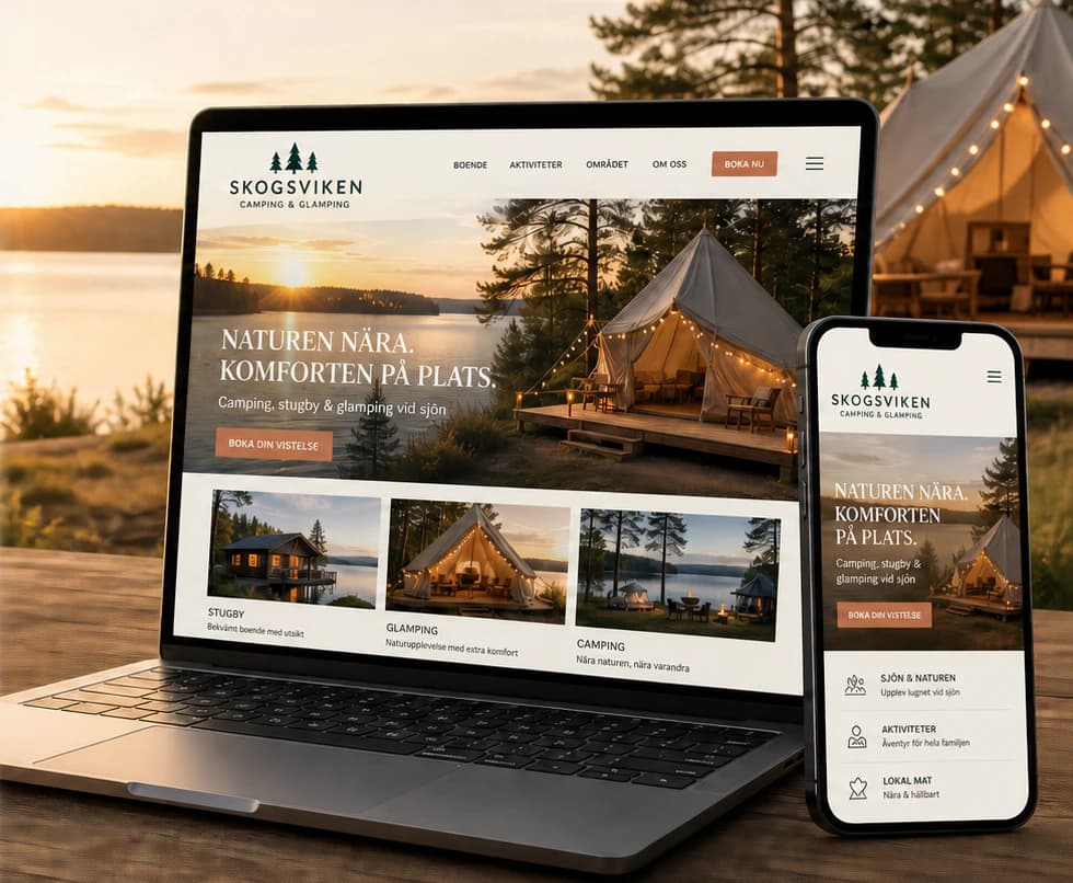
NordSlice
Pizza and fast food with a premium feel — and a website where every screen leads straight to the order.
- Sector
- Food & Beverage
- Scope
- Identity · Website · Mobile · Social media
The brief
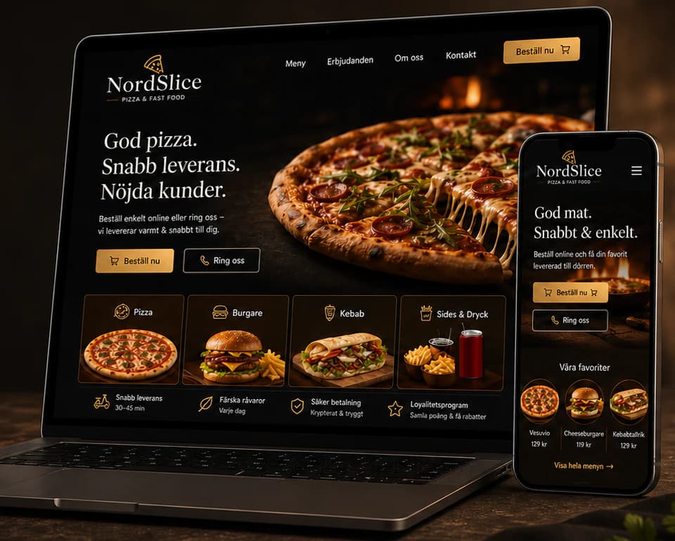
A restaurant serving pizza, burgers, kebab, salads and sides — to eat in, to take away or delivered to the door. Most guests decide on their phone, and a cluttered, dated site with a hard-to-read menu sends them to the phone queue or straight to a competitor.
The idea
We built the identity around warm darkness: near-black, toasted gold and cream, with a pizza-slice mark and a serif wordmark that make fast food feel crafted. The website puts the menu first — categories on the first screen, a pizza builder for size, sauce, cheese and toppings, and a clear choice between delivery and pickup. The same system carries over to the packaging, the QR menu on the tables, the staff uniforms and the social feed.
Identity
Colour
Typography
NordSlice
ABCDEFGHIJKLMNOPQRSTUVWXYZ ÅÄÖ
abcdefghijklmnopqrstuvwxyz åäö 0123456789
Aa Bb Cc
ABCDEFGHIJKLMNOPQRSTUVWXYZ ÅÄÖ
abcdefghijklmnopqrstuvwxyz åäö 0123456789
The website
How the start page works — follow the numbers.
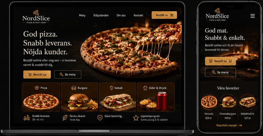
Key screens
What the site does
Before and after
The generic site a brand like this often starts with, and the concept that replaces it.
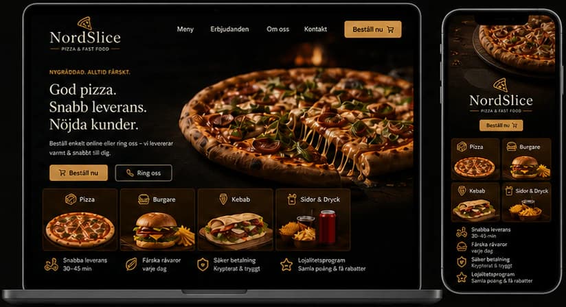
- A clear menu that is easy to browse and order from
- A premium brand that builds trust
- A smoother path from menu to checkout
- Fewer clicks to a finished order
Social media
The brand in use
A design concept by Weva Digital. The brand, website and materials are imagined to show what we can build — this is not a client project.